
In today’s fast-paced digital world, web design layout plays a crucial role in how users experience your website. The types of web design layouts you choose determine not only your site’s visual appeal but also its usability, speed, and conversion rate. Whether you’re a web developer, designer, or business owner, understanding different layout structures can help you build a modern, responsive, and user-friendly website.
A good website layout design balances aesthetics and functionality. From grid-based structures to single-page layouts, each type serves a specific purpose. With evolving technologies like responsive web design, mobile-first layouts, and AI-driven UI frameworks, it’s more important than ever to choose the right layout for your audience and goals.
Read also: Basic Networking Protocols Explained (FTP, HTTP, DNS & More) | Beginner’s Guide 2025
Table of Contents
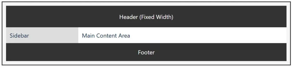
1. Fixed Layout (Static Web Design)
A fixed layout has a set width that doesn’t change regardless of the user’s screen size. This means the design looks consistent on desktops but may require horizontal scrolling on smaller devices.
Best for: Corporate sites, portfolio pages, and designs where pixel-perfect accuracy is essential.
Pros:
- Predictable design structure
- Easy to develop and maintain
Cons: - Poor responsiveness on mobile devices
While static layouts were once standard, they’re now being replaced by flexible and responsive designs to accommodate today’s variety of devices.

Learn more about fixed-width web design on W3Schools HTML Layout Guide.
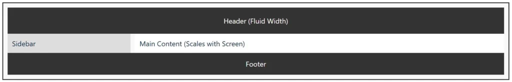
2. Fluid Layout (Liquid Web Design)
A fluid or liquid layout uses relative units like percentages instead of fixed pixels. This allows the design to stretch or shrink according to the user’s screen size.
Best for: Blogs, educational websites, and dynamic content-heavy sites.
Pros:
- Adjusts to any screen width
- Enhances user experience on various devices
Cons: - Can look distorted on very large or small screens
This type of layout works well when combined with responsive design techniques, ensuring visual balance and usability.
See how fluid layouts adapt to different screens in this MDN CSS Layout Tutorial.
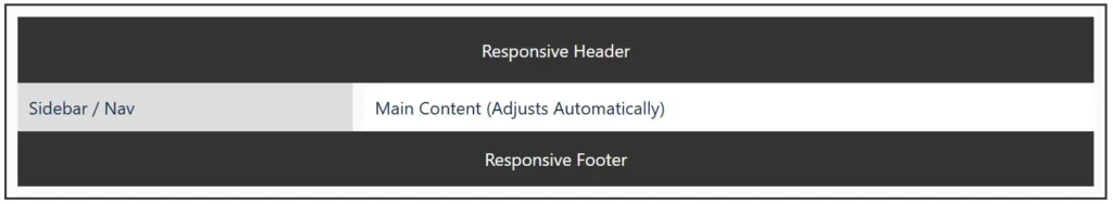
3. Responsive Layout
The responsive web design layout is now the industry standard. It uses CSS media queries to adapt the site’s structure and content automatically for desktops, tablets, and mobile phones.
Best for: Modern business websites, eCommerce stores, and apps.
Pros:
- Excellent user experience across all devices
- Google-friendly (SEO advantage)
Cons: - More complex to design and test
Responsive layouts improve accessibility, engagement, and SEO performance, making them essential in 2025 and beyond.
For deeper insights, check Google’s Mobile-Friendly Design Guidelines and Smashing Magazine’s Responsive Web Design Guide.
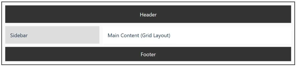
4. Grid-Based Layout
The grid layout divides a webpage into multiple columns and sections, allowing structured and consistent placement of elements. Frameworks like Bootstrap, Tailwind CSS, and CSS Grid make this layout easy to implement.
Best for: News portals, eCommerce sites, and social media dashboards.
Pros:
- Clean, organized design
- Easy scalability for content-heavy sites
Cons: - Can feel repetitive if not creatively designed
The grid layout ensures alignment, balance, and harmony — essential for professional and minimal web designs.
Explore the power of grids with the MDN CSS Grid Layout Documentation and Bootstrap Grid System.
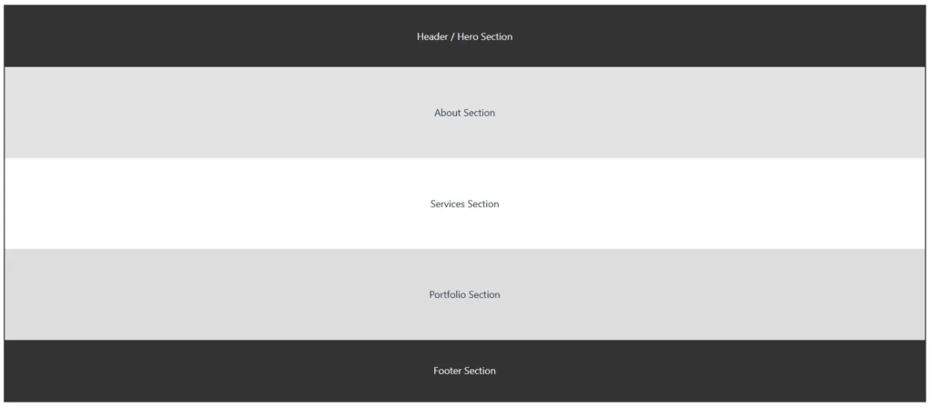
5. Single-Page Layout (Scrolling Design)
A single-page layout displays all content on one continuous page. Instead of multiple navigation links, users scroll to explore sections.
Best for: Portfolios, product landing pages, and startups.
Pros:
- Smooth storytelling and brand flow
- Fast loading and easier navigation
Cons: - Not ideal for large websites with heavy content
Combined with parallax effects and interactive animations, single-page websites deliver an engaging, modern experience.
Discover examples of one-page designs at One Page Love, a showcase of the best single-page websites.
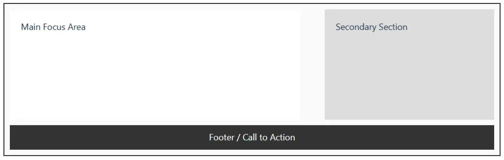
6. Asymmetrical Layout (Modern Creative Design)
An asymmetrical web design layout breaks the traditional grid system to create dynamic and visually interesting designs. It focuses on creativity, visual hierarchy, and balance through contrast rather than symmetry.
Best for: Creative agencies, personal branding sites, and modern portfolios.
Pros:
- Eye-catching and unique
- Encourages user interaction
Cons: - Harder to maintain consistency across devices
When used correctly, asymmetrical layouts make your website stand out while maintaining functionality and responsiveness.
Learn how to balance asymmetrical layouts in Adobe XD’s Asymmetrical Design Guide.
7. F-Pattern and Z-Pattern Layouts
These layouts are based on how users typically read content on a screen.
- F-Pattern: Ideal for text-heavy sites like blogs and news websites.
- Z-Pattern: Works well for minimal and visual websites like landing pages.
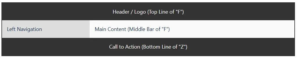
Both layouts enhance user experience (UX) by guiding visitors’ eyes naturally through your most important content areas.
To understand visual scanning behavior, visit Nielsen Norman Group’s F-Pattern Research and Interaction Design Foundation’s Z-Pattern Layout Article.
Final Thoughts
Choosing the right type of web design layout depends on your website’s purpose, target audience, and device usage. For maximum engagement, focus on responsive and grid-based layouts as they offer the best combination of design flexibility, mobile compatibility, and SEO performance.
A thoughtful layout isn’t just about design — it’s about creating a seamless journey that keeps users connected and drives results.
FAQs on Types of Web Design Layouts
What are the main types of web design layouts?
The main types include fixed, fluid, responsive, grid-based, single-page, asymmetrical, F-pattern, and Z-pattern layouts, each serving different design needs and user experiences.
Which web layout is best for SEO?
A responsive web design layout is best for SEO because it adapts across devices, improves page speed, and provides a better user experience—factors favored by Google.
What layout is best for eCommerce websites?
Grid-based layouts work best for eCommerce sites since they organize products clearly and improve navigation and conversion rates.
How does a responsive layout improve user experience?
It automatically adjusts elements to different screen sizes, ensuring readability, accessibility, and consistent design on all devices.
Can I mix different types of web design layouts?
Yes, many modern websites combine responsive grids, asymmetrical visuals, and scroll-based single-page elements for a hybrid, innovative look.

Israr Ahmed Technology educator and IT professional specializing in networking, cybersecurity, software solutions, and digital systems. Founder of DriveInTech, delivering practical tutorials, AI tools, SEO strategies, and real-world digital solutions.